(via Flickr)
Why do the letters on your keyboard spell out QWERTY? Why not ABCDEF? Better yet, why not have the most commonly used letters close together? Let us explain.
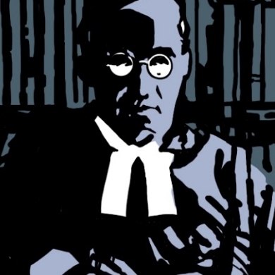
Mark Twain Tries Typing
Hartford, November 1875:
The typewriter came Wednesday night, and is already beginning to have its effect on me. Of course, it doesn't work: if I can persuade some of the letters to get up against the ribbon they won't get down again without digital assistance. The treadle refuses to have any part or parcel in the performance; and I don't know how to get the roller to turn with the paper.
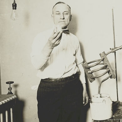
Twain wasn't the only person having problems with his Remington Model Type-Writer. Despite years of tinkering, inventor Christopher Latham Sholes couldn't prevent the machine from jamming, especially when two adjacent keys were pressed down in quick succession. The solution was to space the keys so the most commonly used letters were far apart. By a process of trial and error, Sholes came up with an arrangement almost identical to the standard configuration today. The only exceptions were the A and Z being switched around, along with the R and period sign. It's rumored that the latter two were switched for a simple reason: to enable salesmen to spell out the word “typewriter” on a single line, reducing the risk of embarrassing jams.
Intelligent Design
But is it possible this arrangement also makes it easier to type? Probably not. The Blickensderfer Typewriter keyboard had the configuration "DHIATENSOR,” which meant that (according to the manufacturere) the writer could type three-quarters of English words without even shifting their hands. Other contemporary machines were painstaking calibrated for ease of typing, such as the Hansen Writing Ball, and had completely different key arrangements.
Sticking Keys
People seem to have realised the failings of Sholes' arrangement early on — he disowned it himself — but by then Remingtons were far outselling competitors, mainly thanks to the marketing powerhouse that the company already had in place for its sewing machines. In response, people began to emulate the Glidden-Sholes patent, and from there, it became the standard.
Twain was adamant that he did not want to endorse the machine. In March 1875, he wrote to Remington to say:
Please do not use my name in any way. Please do not even divulge the fact that I own a machine. I have entirely stopped using the type-writer, for the reason that I never could write a letter with it to anybody without receiving a request by return mail that I would not only describe the machine, but state what progress I had made in the use of it, etc., etc. I don't like to write letters, & so I don't want people to know I own this curiosity-breeding little joker.
But Remington had the last laugh 30 years later, when they used the very same letter as part of their advertising:
(via Mark Twain in His Times)
Time Shift
Key arrangement isn’t the only thing modern keyboards borrow from a bygone age. We get the term “shift key” from the way a Remington Model 2 Type-Writer physically shifted the printing bar between uppercase and lowercase. Uppercase and lowercase are themselves much older terms, referring to a 15th century method for keeping track of the little metal letters used in printing presses: Small keys were kept in individual boxes at the bottom of a large case; the capitalized letter were kept in corresponding boxes in the upper part of the case.
Question marks, exclamations and colons are all early printers' equivalents for the previously non-standardised squiggles that scribes used to break up clauses in manuscripts. The @ symbol would also have been part of the earliest Spanish printer's case, where it was used to mean arroba, a specific measurement of weight; it made its way onto modern keyboards thanks to accountants' tendencies to use it as an abbreviation of “at” when laying out prices that items were sold at.
The & sign, or “ampersand,” was on all of the earliest typewriters — in fact, in the 1800s, it was part of the alphabet. Children would recite “and per se and” after Z, which became slurred into “ampersand” over time. The abbreviation itself is Roman, created by merging the letters E and T of the word et together. And this might sound a little odd, but according to many experts, the $ sign, another keyboard mainstay, was created in a similar way: Spanish pesos were the most common currency in the Americas at one time and were represented by the letters SP, which eventually merged into the $ on American coins.
In the book Quirky Qwerty: The Story of the Keyboard @ Your Fingertips, Torbjörn Lundmark describes what economists and politicians call “The Qwerty Effect”: “It often seems better to stick to the old standard than to invent new ways, even if the new ways are more efficient.”
But Lundmark goes on to defend the modern keyboard layout: “A far simpler fact holds true: good typists type fast and poor typists do not.” The origins of keyboard design might seem shockingly arbitrary, but anyone who’s tried using an ergonomic keyboard or one with the keys switched around will know that what works best is what we're used to — even if it really doesn't make any sense.
George Dobbs is an MA graduate in creative writing who lives and works in the grim North of England. When he’s not at work on various writing projects, he enjoys cooking, long-distance running and avoiding the weather with his cat.
KEEP READING: More on Technology