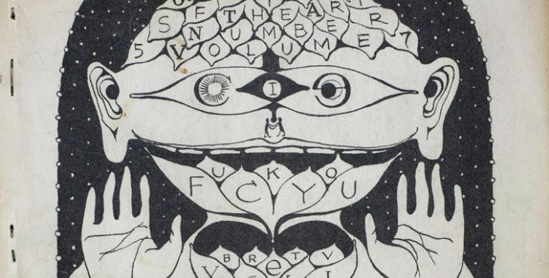
Book cover template (via YouWriteOn.com)
There are layers upon layers of Photoshop or, barring that, some kind of prosaic-to-the-point-of-painful stock photo. (Book title feature the word “eyes?” Here’s an eyeball.) There are various scarring missteps in the selection of type and color — so many that it makes one wonder how a vanity press does not live up to its name enough to focus even one iota on its image.
Books are, indeed, judged by their covers, and some bear them like crosses. Lisa Amoroso, Executive Art Director for G. P. Putnam’s Sons, understands the power of a proper cover. “Word of mouth is great, but the one thing, with the loss of bookstores, is we’ve sort of lost the window display and the impulse buy,” she says. “Even if they are actually buying the book, they are probably buying it more online, but it all starts with a visual. It’s really important.”
Command Authority by Tom Clancy (via Pittsburgh Post-Gazette)
“More and more we look to graphic, clean looks,” Amoroso explains of Putnam’s design strategy — an aesthetic which happens to be diametrically opposed by a good number of self-published books. Putnam’s minimal, powerful designs are better suited to the thumbnail-scanning world of digital book shopping. Tom Clancy’s final novel, Command Authority, for example, is an eye-catching shade of tangerine that leaps off the screen regardless of how small it’s rendered. It also adheres to other tenants of Putnam’s design philosophy, including embossing and foil elements — which make the book look and, perhaps more importantly, feel like luxury items — and the prominent placement of Clancy’s name. “We know we’re branding our authors, so their names are definitely important,” Amoroso says. “We try to establish looks for each and every one of our authors to build their audience.”
Few independent authors have the time, knowledge or skill to approach every angle of a book cover like professional designers can. Take something so seemingly innocuous as type: Simply pick one that looks good, right? Not exactly: “If it’s more literary or important, we might go for a serif type,” Amoroso explains. “If we want something a little more sleek and modern, we might go for a san-serif type.” On rare occasions — romance novels, for example — hand lettering is even commissioned.
All of this, every aspect, from font selection to colors to composition, is put together by a team consisting of representatives from the publisher, editors, the art department, the designer(s), sales and the authors themselves, whose contracts usually stipulate cover design consultation or approval. The whole thing is very much a design-by-committee process. “Usually it’s pretty harmonious,” Amoroso says. “Sometimes we do go a little around in circles.”
The end result, when done properly, is a kind of visual shorthand, representative of the author, the book, the publisher, the times, the various other je ne sais quoi that anything making a successful entry into the zeitgeist must posses. A book cover is, in the very best cases, as beautiful as work it enfolds.
So where are self-published book covers failing? “The overall thing is that they just look very amateur,” says Benjamin Shaykin, a freelance designer based in Providence and critic in the graphic design and illustration departments at the Rhode Island School of Design, where he also teaches typography and publication design. Seeking opinions more educated than my own, I sent him a representative sampling of the kinds of covers typical in the self-publishing/vanity publishing world.
A good number of the covers, Shaykin explains, are trying to do too much. “It’s like they don’t know when to stop,” he says. “I think the main thing a book cover wants to be is one coherent thought. And I feel like what happens to a lot of these is that they’re sort of this pastiche, sort of bad collage, that’s like, ‘It’s about a guy, so here’s a picture of a guy,’ and it’s about a steel mill, so they put a picture of a steel mill. And they just run them up against each other. There’s just no finesse.” That combination of literalness and inclusiveness leads to graphic elements abutting each other violently, a jarring effect akin to heavily Photoshopped mix-tape covers.
“It’s something you’d want to have,” Shaykin says of a proper book cover. “Something you won’t be embarrassed to walk up to the register and buy. You won’t be embarrassed to have it with you on the bus or read it in public.”
Exceptionally designed or famous (or infamous, for that matter) covers become representative of more than content. “I think people use [book covers] as a way to sort of project their identity on some level,” Shaykin says. “We’re seeing interesting things happening, you know, people who start reading books on Kindle, they have cases for the Kindle that look like classic books. Or they start carrying tote bags around with their favorite books on them. … It’s a thing that we use, as shorthand for ‘This is who I am.’”
With the rise of self-publishing and digital sales, Shaykin believes these are revolutionary times for book design, a Cambrian explosion, of sorts. Books need to stand out now more than ever, like Putnam’s embossed, foiled, prismatic trophies — more objets than objects.
Nineteen Eighty-Four by George Orwell, cover designed by David Pearson (via The Casual Optimist)
Ulysses by James Joyce, cover designed by Peter Mendelsund (via Fonts in Use)
An exceptional cover, according to Shaykin, can bridge the gap between author, idea and reader in a graceful way. As such, a cover is intrinsically linked to its book, but examples with which to inspire bootstrapping author’s abound. Shaykin points to David Pearson’s cover of George Orwell’s Nineteen Eighty-Four for Penguin: Along with Penguin’s classic orange and white, the title and author are rendered in black on black, as if redacted, perfectly encapsulating Orwell’s dystopian novel. Peter Mendelsund’s Ulysses, in sea foam and black surgical scars, similarly evokes the jovial and verbicidal legacy of Joyce’s crucible.
Minimalism also often pays dividends. Consider the iconic Little, Brown white field and rainbow corner design or Catherine Casalino’s soft cover treatment, for Hachette, of Christopher Hitchen’s Arguably, whose screaming cyber yellow color scheme seems contrarian even on the shelf.
“I think it can be done,” Shaykin says of self-publishing authors conquering the aesthetics of book covers. “It’s not inherent that it has to be bad just because someone is putting it out by themselves. I would say it’s important to find a professional and trust them. They know what they’re doing.”
After the writing is done, the full scope of an author’s passions and talents should be brought to bear upon their jackets. “Ivan Held [President of G. P. Putnam’s Sons] has what they call ‘the one second rule,’” Amoroso says. “If you don’t get it in a second, it could be lost.”
B. David Zarley is a freelance journalist, essayist and book/music/art critic currently based in Chicago. His work has been seen in VICE, Sports on Earth, The Classical, Paste Magazine, The Myrtle Beach Sun News and numerous other publications. You can find him on Twitter, @BDavidZarley, or on his website, bdavidzarley.com.
KEEP READING: More on Publishing


 A Black Balloon Publication ©