It’s no secret that I’m obsessed by book design. Half the time I’m in a bookstore with friends, I’m showing them books with amazing covers — "Remainder is just gorgeous, isn’t it?" Sitting down in the rare books section of university libraries, I always make sure to look at the medieval hymnals and fragile manuscripts other patrons have requested.
Emilia Terragni wrote a piece on the value of book design, but there's a lot more to say about well-designed books and their power to fulfill and confound our expectations. Check out these five pairings and you'll see what I mean.
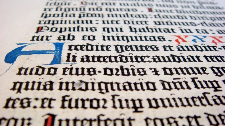
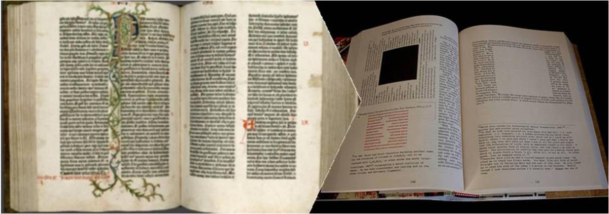
Harmonious proportions — proportions that were established with the Gutenberg Bible and refined over the following centuries — are the hallmark of a beautiful book. The takeaway: a 2:3 ratio is pretty close to perfect harmony, and generous margins delight all readers. These were principles Mark Z. Danielewski kept in mind centuries later as he designed House of Leaves; even on the most chaotic pages, he’s kept a clear sense of hierarchy between his various elements.
These books struggle with the same design problem: how to provide commentary around a single, central text without drowning the reader in footnotes. In the Talmud, the original Hebrew text is surrounded by multiple columns of text in different sizes to distinguish the words of different rabbis. In the latter case, an article that became part of John D’Agata’s book About a Mountain is bracketed with the email conversations between the author and his factchecker, with colors distinguishing verified and unverified statements. In both cases, the original text remains a focal point, with the metatext as a well-designed counterbalance.
Even the individual letters of a book matter. The Mainz Psalter, like many other illuminated manuscripts produced before the Gutenberg revolution, boasts gorgeous capitals at the beginning of nearly every paragraph. The tradition largely died out after the rise of the printing press, as non-uniform letters and images were difficult and time-intensive to typeset. But when James Joyce published Ulysses in 1922, he insisted on full-page drop caps for each of the three major sections of his book, partly in homage to these old manuscripts. And he got what he wanted: Buck Mulligan’s "stately, plump" form is swallowed up by the stateliness and plumpness of the S opening his first chapter.
Before the codex became a viable print format, accordion books were a popular way to fold pages, and Japanese artists upheld the convention, often in the name of preserving panoramic scenes that otherwise would have been contained in scrolls. The Canadian poet Anne Carson revived the format to reproduce the notebook she had filled upon learning of her estranged brother’s death. In its folds, she was able to show individual moments as well as a full arc, a sequence of images and meditations on her life and her brother’s, as well as the components of the poem by Catullus she struggled to translate as she grieved for him.
After the rise of the codex, numerous authors wrestled with the necessity of binding pages together. B.S. Johnson decided to create a book with chapters that could be rearranged at will, and so the individual chapters were boxed together but (aside from clearly-marked "first" and "last" chapters) ordered randomly. Decades later, Chris Ware took the same tack in putting together a collection of comics describing people and lives around the same apartment building. Building Stories boasts tabloid-format papers, flipbook-style comic strips, and much more, all in a single box.
Whenever I look at the Kindle and epub files, I can’t help noticing that the principles of design — even on the simplest level, such as fully justifying the text instead of leaving ragged edges — hold less sway, and so it’s a continual surprise to come across physical books that just make me want to look again — and again.


 A Black Balloon Publication ©