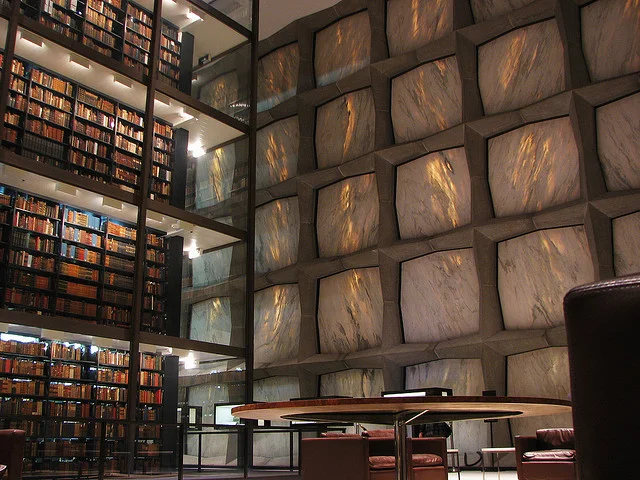
The Beinecke Rare Book and Manuscript Library at Yale University; New Haven, Connecticut
Like many young book lovers, athletically challenged and painfully self-aware, I found my childhood home-away-from-home in a library. Now, the public library in Wilmette, Illinois is no Alexandria, with its weirdly fascistic 1970s façade, wall-to-wall carpeting, fluorescent lights, and abundance of laminate. But it had plenty of tall shelves to hide behind, every C.S. Lewis book ever written, and a distinctive lack of soccer balls hurtling at my head. It served its function well.
This
was a time where I valued function over aesthetic. I still do, in most
cases, but in 1999, so long as an object got the job done, beauty was a
necessary casualty. My favored L.L. Bean turtlenecks, for example, may
not have been the most fashion-forward, but the cuffs provided an
excellent alternative to gnawing on my fingernails. The same rule
applied to libraries. “You put all the books in a room and people go to
the room to get the books.” That was the philosophical extent of my
library concept.
Nearly a decade and a half later, my standards have shifted. Living in New York City, a world away from the suburban comforts of northeastern Illinois, can feel like a never-ending chore. Instead of vast expanses of boredom punctuated by moments of excitement, life in New York is more like that elementary school habit of running breakneck through the halls, slowing only to a walk when passing a classroom door. Everyone looks at ease, but on the inside, we’re all in a constant state of minor panic. So moments of peace and beauty, few and far between, are savored—and definitely sought out. Aesthetic becomes just as important as function. In fact, in a city where we’re used to paying obscenely high sums for substandard function (looking at you, Time Warner Cable), aesthetic can be almost more important.
Now, when I go to the library, when I make the decision to walk the five avenues separating my Yorkville apartment from the nearest subway station, clawing my way through the commuting masses, it has to be for a special library. The kind of library that opts for oak over particleboard, marble over carpet, chandeliers over fluorescents. The kind of library that offers an experience.
The Main Reading Room; New York City
When I settle into a seat in the Rose Main Reading Room at the flagship New York Public Library on Bryant Park, that’s what I get: an experience. I may only be G-chatting and updating my Netflix queue, or procrastinating on Sporcle instead of writing an article, but the Rose Main Reading Room makes me feel like I could be doing more. I can imagine I’m hard at work on a dissertation for the Oxbridge degree I’ll never have, but always wanted. The rows of long tables complete accented with tiny reading lamps help paint that picture. You see, for me, what makes a library reader-friendly is the quality of illusion it can sustain. The Rose Room reinforces to distinct fantasies: 1) That I am actually progressing towards the completion of a substantial creative work, and 2) that the dying world of printed matter, and writers who write for print, is still strong and alive. (He said as he wrote a piece explicitly for web.) Oak wood, old books, oil paintings—these are all components of my Anglo-American literary fancy.
I write. Many of my friends write, or work in art galleries, or at non-profits, or are setting off down the long road toward a doctorate of questionable utility. We all have liberal arts degrees, and we all feel at home in libraries. We spent a sizeable portion of our undergraduate years in them, pouring over translations of the Vedas and microform of newspapers from V-J Day. So, to round out my exploration of library reader-friendliness, I surveyed them.
University libraries are so central to the goings on of any campus that they’re almost characters of school lore. More often than not, students refer to them by the name attached to the building: Beinecke, Bobst, or Widener; and often in the same, good-natured tone of voice that you might use to refer to your eccentric great-aunt, or a friendly hobo who likes to pick through the dumpsters behind the dining hall.
The Royal Portuguese Reading Room; Rio de Janeiro, Brazil.
While all university libraries seem to be universally beloved, if even begrudgingly during midterms and finals, most can be divided into two broad, albeit distinct camps. On one hand, you have the moderns: the Beinecke at Yale with its geological faux-windows, Middlebury’s spacecraft-like Davis Family Library, and the bubble of segmented glass that is the Mansueto at the University of Chicago. On the other, you have the traditionals: the museum-like Peabody at Johns Hopkins, the iconic Bodleian at Oxford, and the Hogwartsian Suzzallo at the University of Washington.
Whether you studied at Indiana University’s monolithic Herman B. Wells library, or the tiny but picturesque Pelletier at Allegheny College, the consensus on the most desirable quality in a university library is remoteness. A place far removed from the gastronomic distractions of the dining hall, and the social distractions of virtually every other place on campus. “I used to go down to the basement because sometimes the wi-fi was faulty down there and nobody would bother me,” my friend Mark, a graduate of Michigan State University, recounts. “I go hermit. Get in the zone.”
But if remoteness is the sole necessary factor, why not study in an underground bunker? No frills, no interruptions. I ask this very question of Emily, a Harvard grad who claims to have “literally lived” in the university’s Widener Library while completing her thesis. “It helps to be in a collegiate atmosphere,” she explained. “[At Widener], I was surrounded by students and professors, old books, and paintings of alumni. Everything was a constant reminder of what I was there to do—study, and graduate, eventually.”
Even in adult life, it seems the “collegiate atmosphere” can be a phantom limb. My friend Maria, a Brazilian native who studied at Northwestern University, says Rio’s Royal Portuguese Reading Room offers Old World solace in a rapidly evolving city. “Everything in Brazil is so new,” she told me, referencing the country’s recent economic boom. “It’s all glass and concrete, and that can look nice sometimes, but it’s good to work in a space that has character.” And if age equals character, than the Royal Portuguese Reading Room, which dates back to 1880 and has been called “the Bodleian of South America.” has character in spades.
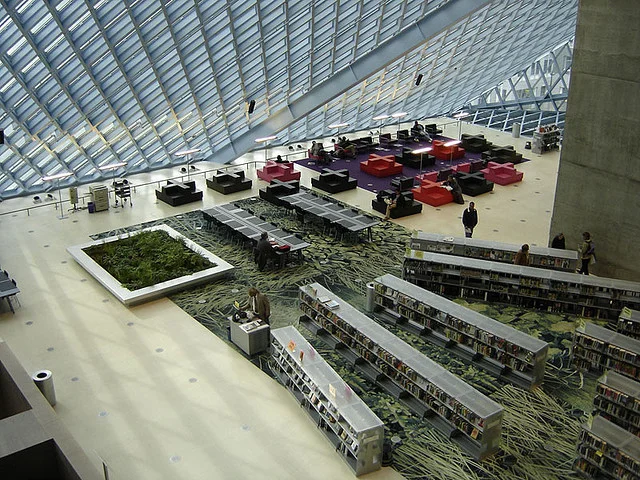
The Central Library; Seattle, Washington.
But newer spaces can have their own appeal. “Clean lines and lots of light,” says Jaeyon, a graduate student at the University of Washington who prefers Seattle’s sparkly, modern Central Library to the school’s more traditional Suzzallo. “It’s pleasing to the eye, but not distracting.”
With all due respect to Jaeyon, sometimes a little distraction is necessary to soldier through a stagnant paper, or glean some much-needed inspiration for a faltering story. In my opinion, the most necessary architectural feature of a library is ample space for and easy access to the goods—the very things that bring us to a library in the first place. The things that put the lib- in “library.” Books. Shelves and shelves, floors and floors of books. Say, I can’t find a way to land a particular point in an essay. Solution? A navigable path to the nonfiction section, where an up-to-date copy of The Best American Essays lies in wait.
After all, what’s the point of a good vaulted ceiling if you can’t read Poe beneath the rafters? What good is a dog-eared copy of Gatsby if you can’t read it while reposing on a leather bench in a marbled, art deco lobby? It seems, in the end, aesthetic is only as good insofar that it facilitates function. And functionality is only bearable in the presence of a good aesthetic. Fluorescent lights get the job done, but a chandelier is such a nice touch. “You put all the books in a room ” indeed, “and people go to the room to get the books.” But something, perhaps a flying buttress or two, keeps you there.
Credit: Flickr users Lauren Manning, Paul Lowry, Dan Vitoriano, and fimoculous. Used with a Creative Commons license.





 A Black Balloon Publication ©